Role: UX/UI Designer
Tool: Figma, WordPress, Gmeet, AI illustration
1. Project Overview
A full redesign of the Call My Dokter website — aimed at strengthening the brand, improving the user experience, and making the messaging clearer for corporate clients and health partners.
2. Background
The old site felt outdated and a bit broken, and it didn’t really speak to any specific audience. For this redesign, we shifted the focus so the website clearly speaks to corporate clients and healthcare partners, which are now the main targets.

3. Research & Discovery
Here’s how I aligned the design with the client’s goals and audience:
- I started with a meeting to understand the business goals and who the site should really be for
- The first version tried to speak to patients, companies, and health providers — but after more input, we narrowed it down to just corporates and health partners
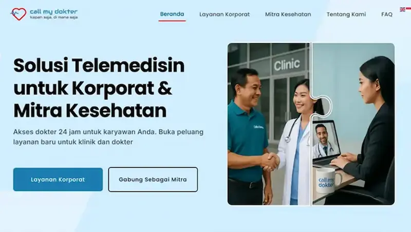
- I changed the hero visual from a semi-flat illustration to a more professional, photo-style image that better matches the new direction
- Reviewed the old site and reorganized everything — content, layout, and flow — to make it cleaner and more business-ready
- After the second meeting, the new layout got a thumbs up. Only a few tweaks to the copy left. The design is about 90% done and now in the final refinement phase

Client alignment session illustration
4. Brand Colors & Visual System
- The core brand colors — blue, grey, and red — stayed the same
- Blue is used for buttons and main highlights
- Red is used sparingly, mostly for active states (like in the nav bar)
- I added a range of soft blue tones for backgrounds and details — this helps keep the UI clean, professional, and friendly

5. Hero Section: Headline & Illustration
- The headline and subheadline now clearly tell visitors what Call My Dokter does, especially for companies and health partners
- The hero illustration uses a puzzle concept — showing Call My Dokter as the connector between the corporate world and the healthcare world
- I created the visual using AI-generated image (more about the process in section 8)

Site Structure: Main Pages Accessible from Top Navigation

6. Website Structure
The homepage is structured to guide users through a smooth, purposeful flow:
- Hero: Key message and brand illustration
- Value Proposition: Simple breakdown for each target audience
- Onboarding Steps: Visual explanation of how it works
- Testimonials: Real feedback to build trust
- FAQ: Quick answers to common questions
- CTA + Footer: App links, contact info, and more
Top navigation gives easy access to pages like Corporate Services, Health Partners, About, and FAQ.
Note: Preview only — project is still in progress and not live yet.
7. Before -After Comparison
A simple side-by-side of the old vs. new homepage — showing how much cleaner, clearer, and better structured the new design is.


8. Visual Production
Most of the icons and illustrations were made using AI-generated image. It saved time, but still took a lot of prompt tweaking and sketching to get things just right.
For the hero visual, I picked the second image as the final version. It’s stronger both visually and conceptually — the puzzle idea tells the story perfectly: Call My Dokter connects companies with healthcare partners.
You can see both versions below: the first draft, and the final choice after lots of back-and-forth.

- Initial draft – early AI result

2.Final hero visual
9. Key Improvements
Here’s what changed and why it matters:
- Brighter and more consistent colors
- Clearer messaging focused on the right audiences
- Better layout and structure
- Faster asset creation using AI (but always with hands-on design direction)
10. Status & Next Steps
The project is still in progress and currently in refinement. While most of the core design has been approved, there’s still room for adjustments depending on the final direction.