
Role: UI/UX Designer
Tool: Figma, WordPress, Gmeet, AI illustration
1. Project Overview
Call My Dokter Mobile App Redesign
This is a self-initiated UI/UX redesign of Call My Dokter’s mobile app. The goal was to modernize the interface, improve the overall user flow, and introduce a smart new feature: an AI-powered Health Assistant.
2. Background & Problem
After I was brought in to redesign the Call My Dokter website, I found out during a client meeting that a mobile app redesign was also part of their plan. But at that time, no official request or brief had been given.
So I decided to take the initiative and explore the redesign on my own.
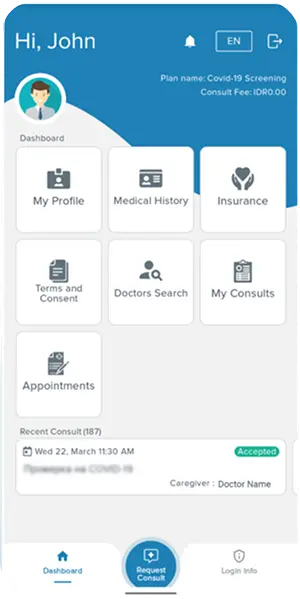
The tricky part? The app isn’t publicly accessible — it’s only for registered users, and there’s no open sign-up even though it’s listed on Google Play. I had never used the app myself. The only thing I could work with was seven screenshots from the Play Store.
With such limited material, I had to make several assumptions and rely on UX best practices and industry standards to fill in the gaps.
3. Goals & Objectives
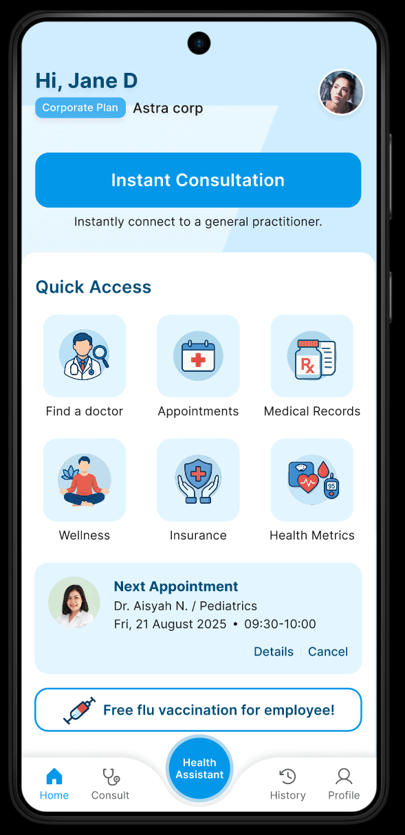
- Give the app a modern, clean, and up-to-date look
- Make the user journey smoother — booking, chatting, and checking records should feel effortless
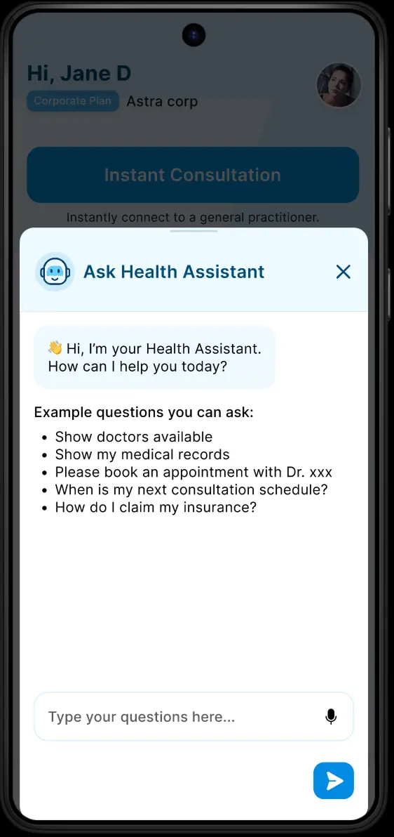
- Add a Health Assistant feature — AI-powered, helpful, and easy to access
- Make sure the app’s style matches the newly redesigned website
4. Research & Discovery
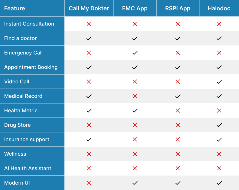
With only screenshots to go on, I did competitive research and benchmarking. I looked into top local healthcare apps like RSPI, EMC, and Halodoc, studying how their flows, features, and pain points were handled.
I also explored the technical side of things — checking if adding an AI Health Assistant (like ChatGPT) was actually feasible with third-party tools. This helped make sure all ideas I proposed were realistic and possible to implement.
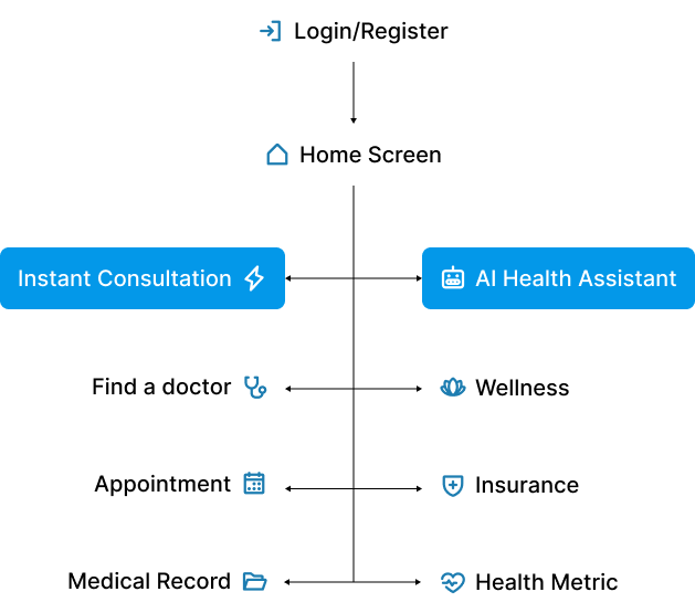
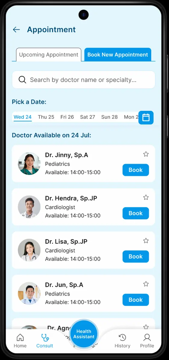
5. User Flow & Information Architecture
Since I didn’t have access to real users or usage data, I based the new flow on what worked best in the apps I researched.
The priority was to cut down on unnecessary steps and make important actions — like searching for doctors, booking a consultation, or viewing health records — easy to find and use.
I also added a new section dedicated to the AI Health Assistant, making sure it was easy to reach without cluttering the main navigation.
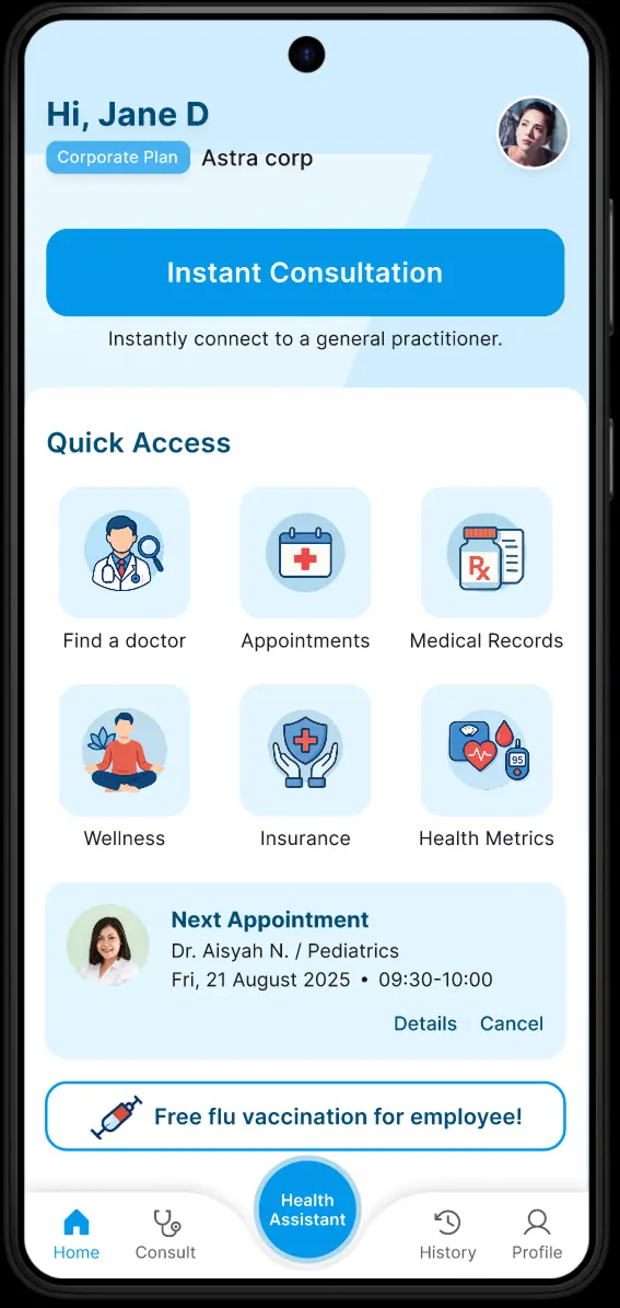
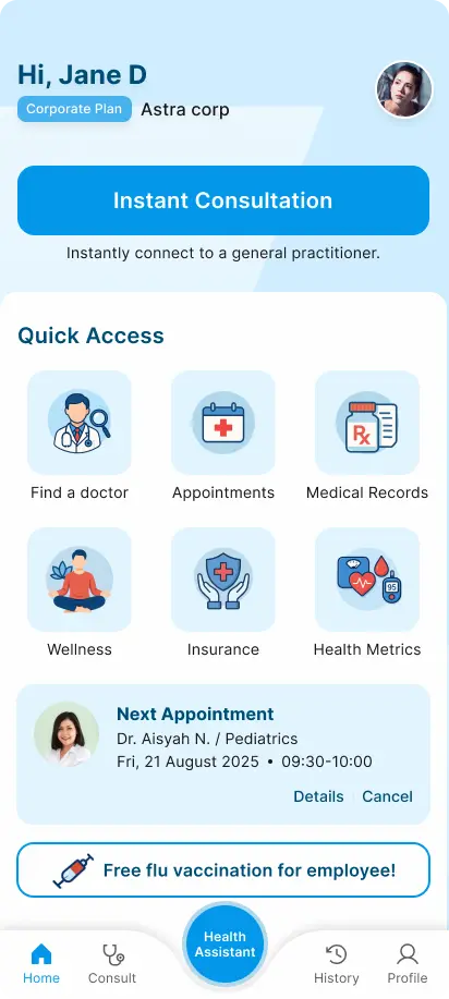
6. Ideation & Rapid High Fidelity Design
Instead of starting with wireframes, I went straight into high-fidelity mockups. This helped speed things up and gave a clearer visual direction right away — useful when sharing ideas with the client. I used design patterns from leading health apps to guide decisions and create something that felt both familiar and fresh.
7. Visual Design
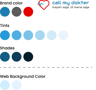
To stay consistent with the website redesign, I kept the same blue and white color scheme. It’s clean, trustworthy, and fits the brand well.
I generated all the icons using AI-generated image, which was super helpful, but also required a lot of fine-tuning. AI-generated visuals can be a bit hit-or-miss, so I had to tweak things a lot to make everything feel polished.
8. Prototype & Interaction
I built an interactive prototype to show how the main flows would work — from onboarding, to using the Health Assistant, to managing appointments.
I paid close attention to microinteractions and feedback states, so the app would feel smooth, responsive, and trustworthy — which is especially important in healthcare.
9. Design Rationable
Here’s what guided my design choices:
- Empathy — understanding that users might be stressed or unwell when using the app
- Best practices — following proven patterns from top health apps
- Scalability — making sure new features like the Health Assistant could grow without breaking the flow
- Brand alignment — keeping the look and experience consistent with the website
10. Before & After Comparison
Before: Outdated, crowded, unclear navigation.
After: Modern, clean, intuitive, AI-powered.
11. Outcome & Impact
When I shared the redesign and Health Assistant idea with the client, the feedback was really positive.
They were excited about the new features and direction, and it opened up discussions about possibly turning this concept into something real — including planning the full user flow and getting assets ready for development.
12. Status & Next Steps
- Even without a brief, taking the initiative helped me bring real value and show my thinking process
- Research and benchmarking really helped when I didn’t have full access to the app
- AI can play a big role in healthcare UX — but it needs thoughtful planning
- Having consistency between the website and mobile app builds trust and makes everything feel more professional
13. Disclaimer
This redesign is a self-initiated project, based on public screenshots and informed guesses from similar health apps. The final product may end up looking different depending on client direction, tech limitations, and real user feedback down the line.